Friday, June 12, 2009

Done

So the bunny needs somewhere to go so ive created a scene for in by editing a picture of a street in london
.


Here is the final piece. Things to look for... street is grass... giant bunnys... my dog.... sniper in a window, facing a spy from tf2 (http://www.teamfortress.com/)... earth and the moon featuring my g/f's face... random posters and graffiti.


It took a while, hope you like it

Here it is....


Final Project Digital Alchemy

ok so i had no idea what to do for this one, but i need a crazy idea... so here it is....

Animals but without heads instead they have the hand gesture that represents it... hard to imagine but here it is:

Final

Heres the poster all together, happy with it has he feeling i was after: (colour is skrewed again, look at the one i handed in)

Box

Ok so i made a 3d model of the noodle box in sketchup so put my images on, took a while to get it all straight as the pohotoshop box web wasnt exact here it is:

getting there

ok so ive done the basic design, still needs some work but its getting there! (cloour screwed up on load)

Next assigment

This assigment is the candy box design. I want to create my own cany based on the brand yupi candy. I want to make gummy noodles and use a noodel box for them to be in. I took some photos of snakes to use as noodles on the packaging, (natural confectionary company snakes)

postcard finished


This is my final post card, reperesenting the differences
and similarities between american and japanese pop art
and pop culture.

Sunday, April 26, 2009

EXERCISE 3: POP ART POSTCARD


Brief “Isn't life a series of images that change as they repeat themselves?”
ANDY WARHOL
Using Photoshop, illustrate the above quote in a Pop Art/photo-collage
inspired postcard.


So for our new brief we have to make a sort of pop art inspired post card which sounds a bit generic but after looking at some examples you can make it more inspired by pop art and not pop art itself. here are some examples i liked and will try to get some inspiratin from.


John Heartfield created ww2 inspired work which i fell work really seamlessly as images that i like and it dosent use the bright colours which i automatically associate with pop art ie andy warhol

refined chess poster


after talking with joel ive decided to simplfy my design so heres the final simplified layout for my chess poster

Wednesday, April 22, 2009


complete the posters, i used and orthogonal view for the main artwork in front of the set at each end on a background. Ive done two versions, one with a checkerboard background and one with a rendered one, i prefer the later just not sure if it can be submitted as the render was not done on illustrator, anyway here they are

Monday, April 20, 2009


couldent help my self so i took the pieces over to sketchup, made a quick model and rendered them using vray, they turned out nicely and i think they work really well as a set.

Pieces, 2d


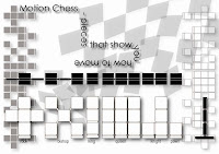
So from my sketches ive designed the pieces from front on in illustrator, each piece represents the way it moves on the board and is very simple yet i think effective in design

Inspiration


So ive been thinking about what ill do for a chess piece and have ahd no ideas until i actually played a game. Ive decided on basing each chess piece on how it moves on the board. So here are some initial sketeches to get me going and to illustrate what i mean, sort of like a beginners chess set.


so i found two pieces i liked form the olden days. This first one is of a european queen form 12th century spain. Its a good piece just because of the detail, i looks like a sculpture just by itself.


This next one is my favourite because it looks like a modenr interpretation of a chess piece yet it is actually and ancient one depicting a king on elephant back.

New Brief

So this new brief is basically to design a new set of chess pieces and use them to create a black and white poster. Should be interesting, will start with some research

Mandala Complete


Heres my mandala finished, happy with final result, time for next project!

Wednesday, March 25, 2009


here are the rest of the characters, im trying to capture the pixelated effect of the original super mario bros, now its time to turn these into a pattern...


Sunday, March 22, 2009


these are some of the elements of the mandala ive outlined today, i stuck to the original colour palette except for mario because his original red overalls and brown shirt looked crap compared to the more well known blue overalls and red jumper, enjoy

block

just starting making elements for my mandala, started off simple with a block from original mario, here it is... the old school pixelated look is maybe an aesthetic i can use to tie together my mandala..

Saturday, March 21, 2009


so ive found a shot of the very old mario, looking for elements to make up backgrounds, that can be repeated, so im thinking of using the mystery box and brickwork to make geometric patterns as well as pixelated mario and the ground pattern

flowers....


thought i,d try apply the skills to some simple forms, so heres some flowers i have done using the technique, the one one the left uses the one on the right as petals, which creates an intricate pattern

illustrator


so we just learnt how to make repeating circle patterns in illustrator which ive been experementing with a bit, you can get some pretty good calieda scope effects, probably will use something similar to make my mandala have a complexity and intricacy about it which i couldn't get by hand, heres a screen grab of the work...

Wednesday, March 18, 2009

Rest of the gang


Just looking at the rest of the mario gang, probably frogot some but here are the main culprits, luigi, yoshi, live giving mushroom (interesting concept), princess peach, boo the ghost, wario and bowser........